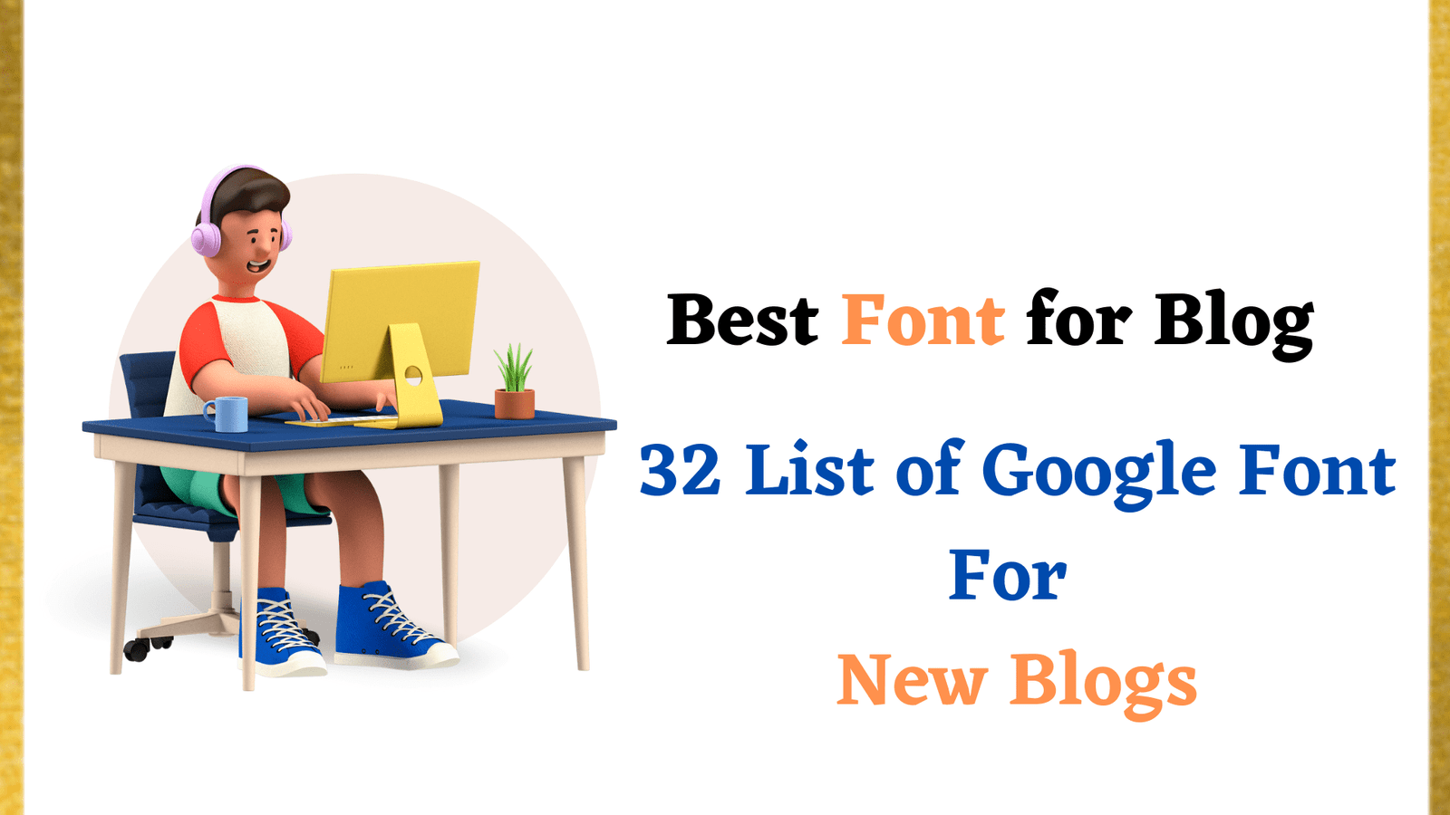
What are the best fonts for the blog? Choosing a font is not easy. There are many factors to consider when selecting a typeface, from aesthetics to legibility and more. This post will help you decide on which font is right for your blog or website by exploring what makes them so special and how they can be used effectively.
Most people think of fonts as a method for adding style, flare, and personality to their work. But this is only the simplest explanation of their importance.
The truth is that there’s a lot more going on inside your font than you might realize – and you can improve your presentations too with some careful choices. So we’ve created this blog post on why typography matters (and how!)
Nowadays it seems like the font choice isn’t as important as the quality of your message but that’s not true because if you make a bad font choice you’re going to confuse your readers.
Also depending on what kind of design you want for your website (modern, retro, hipster, etc.) is going to affect which fonts you use.
Why Fonts Matter For Readability
There are some factors to consider when choosing the best font for your website, but it’s worth noting that while we take the time to think about design every day, there is one element that often gets overlooked-fonts.
Fonts are so important because they affect readability and usability. If your site has a hard-to-read font (or really any font with small letters) chances are visitors will leave as quickly as they came, never to return again.
3 Rules For Using Fonts
1) Use just one primary typeface to avoid clutter
Use no more than 2 families of fonts within your brand. If you have multiple typefaces make sure they play off each other in terms of style and weight but still remain consistent with your message and branding.
2) Keep it readable
Avoid complex fonts as they are harder to read but use styles that simulate handwriting (known as script or hand-lettered typefaces). Handwritten letters usually have a cursive flow or draft quality, making them easier to read. Also, make sure the letter spacing is not too tight. If you put a lot of space between letters, such as with some fonts, they can become too thin and difficult to read.
3) Keep it unique
Avoid using fonts that everyone else is using. There are many free font downloads available online so try creating your own or simply pay a professional web designer to do it for you.
GeneratePress theme is one of the best options that covers all the above rules.
Which are the best fonts for the blog?
The best fonts for blogs are those that are easy to read, with lots of white space.
The font should be a size that is not too large or too small and the lines shouldn’t be crammed together. The reader’s eye should have room to move across the page without getting lost on words near the margin.
Some fonts can look great online but terrible in print, so it’s important to see if your chosen font will work both ways before you decide on one.
Finally, make sure your blog post title looks good in all these different types of fonts before deciding which one to use!
There are many fonts to choose from when it comes to blogging. There are some free and paid-for fonts available on the internet, so you have plenty of options!
One thing that is important though, is making sure your font will work well with your blog post content. With this in mind, we have compiled a list of what we think are the best Google fonts for blog posts. Let’s take a look at some of them now…
Here are a few of the best Google fonts for blogs that integrate both color contrast and text style well.
1. Roboto
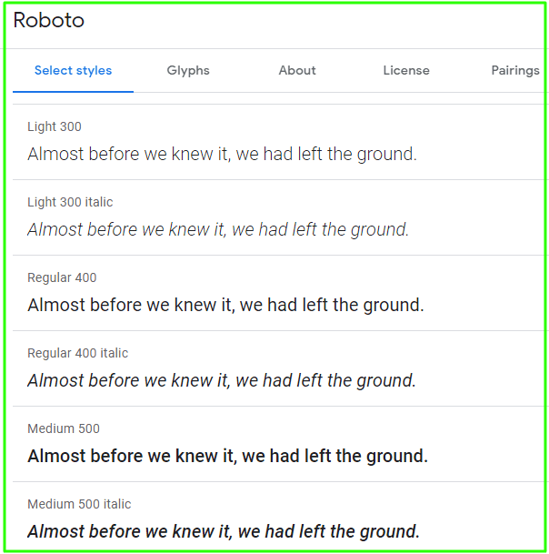
The Google font Roboto is a type family of sans-serif fonts developed in 2011 that has been designed by Christian Robertson.
It is intended to be a modern, humanist sans-serif font with good legibility for body text as well as being easily readable at small sizes. The typeface comes in four styles: regular, condensed, extended, and slab.
Roboto is an attractive font for web and mobile design because it shares many of the qualities found in other popular sans-serif fonts.
It provides many the benefits such as simple clean lines, open forms, and open curves. It is also highly legible, especially when used on the web and at smaller font sizes.
2. Open Sans

Open Sans was designed with an upright stress, open forms, and a neutral, yet friendly appearance. It was optimized for print, web, and mobile interfaces, and has excellent legibility characteristics in its letterforms.
This typeface is very useful if you want a clean look that isn’t distracting from your content but still looks friendly and approachable.
It fits great on longer passages of text because the design won’t feel boring or overused when used to accompany photos, videos, or quotes.
The font blends well with most images, especially those that are colorful and high quality while also being easily readable even in smaller sizes like headers.
The font works great with social media posts as well as long blog articles so you can easily add the font to your content for blogging and a way to make it stand out
3. Lato
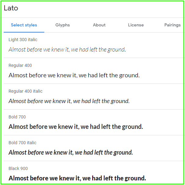
Lato is another font that was designed by Łukasz Dziedzic but this time around for Google. It’s definitely one of the most popular font choices online today given how easy it is to read at a small size while also providing some unique character at larger sizes.
The font comes in 2 different weights with the light version having a thinner appearance than the regular option which allows you to not only optimize your text for larger displays but also ensure its legibility.
If you’re looking for something that isn’t as basic as fonts like Arial or Helvetica then this is definitely one of the best options out there since it’s easy to read yet still has some unique character and styling that will make your content stand out on the page.
4. Montserrat

Montserrat was built with mobile devices in mind which means it has been optimized specifically for smaller displays while still retaining an elegant style that is easy to read at any size.
The font is known for being one of the best Google fonts when it comes to web development since its default settings provide a subtle yet unique look that won’t distract from your content but will add a little bit of flavor along the way.
While it’s not as thick as something like Lobster, Montserrat still has a unique style that doesn’t look like anything else on the web.
5. Yantramanav
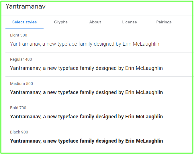
Yantramanav, a new typeface family designed by Erin McLaughlin is optimized for Devanagari scripts. The style and weights of Yantramanav’s Devanagari were carefully created to match Roboto’s Latin font design from Christian Robertson.
6. Oswald

Oswald is a simple and traditional font that will be the perfect addition to any blog. It’s got an old-school feel with its retro style, but it still looks modern enough for today’s audience without feeling outdated or out of touch.
There are six different variations available: light, regular, semibold, bold, and black – so you can find one just right for your content! Oswald pairs well with Lato typeface as both have similar styles; pairing them together would result in a balanced design scheme found throughout your page layouts.
7. Poppins
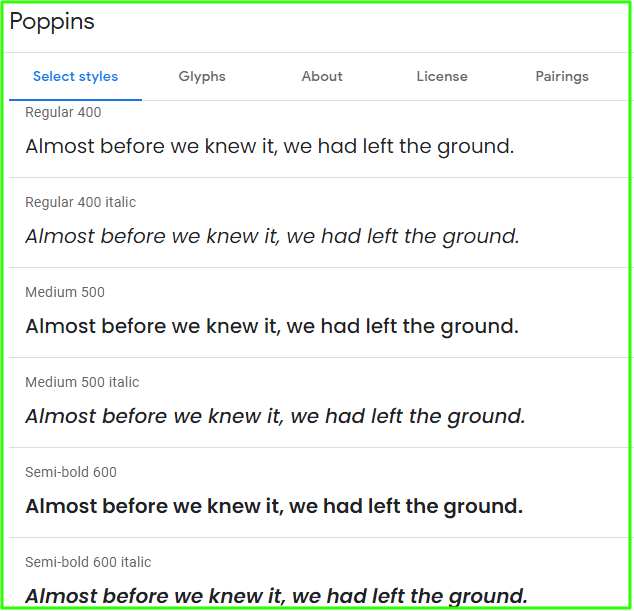
If you want something fun then go with Poppins which has been used by bloggers and brands who are looking for something playful.
If you’re writing short passages about food, fashion, or other light topics then this script style will be perfect since it’s very legible while also being fresh and different from most other serif typefaces.
The serifs on this font are thin and a bit exaggerated which also makes it great for use on social media where you need to include the brand’s name.
8. Noto Sans

Noto Sans helps to make the web more beautiful across platforms for all languages. Currently, Noto covers over 30 scripts and will cover all of Unicode in the future. This is the Sans Latin, Greek, and Cyrillic family.
It has Regular, Bold, Italic, and Bold Italic styles and is hinted. It is derived from Droid, and like Droid, it has a serif sister family, Noto Serif.
Noto fonts for many other languages are available as web fonts from the Google Web Fonts Early Access page. Noto fonts are intended to be visually harmonious across multiple languages, with compatible heights and stroke thicknesses
9. Raleway
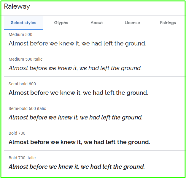
Raleway is a clean, sans-serif typeface that was first released in 2012. It comes in nine styles and has both old style and lining numerals, standard and discretionary ligatures, a pretty complete set of diacritics as well as a stylistic alternate inspired by more geometric sans-serif typefaces than its neo-grotesque inspired default character set.
Raleway has a strong personality, yet maintains readability. It is optimized for use at very large sizes (although it works well even at smaller ones) and does an excellent job both in the text and on display.
10. PT Sans
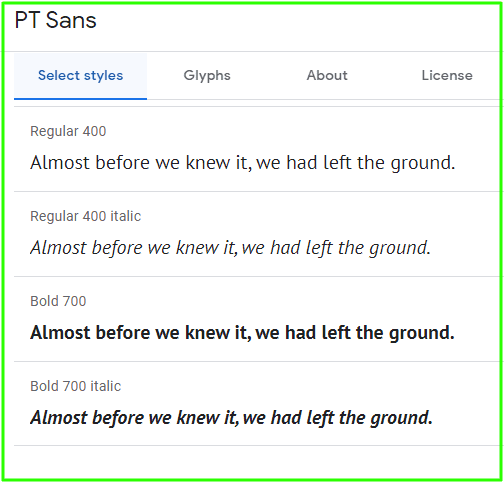
If you want to make a serif font work without it feeling heavy or old-fashioned, go with PT Sans.
This is a sans-serif typeface that can be used as a header of text and still remain legible because the design is simple enough not to take away from the content underneath it.
Now many websites are using this typeface which gives it added versatility when compared to other sans serif fonts out there, and that’s why we’ve added it to our list of the best fonts for websites.
11. Ubuntu
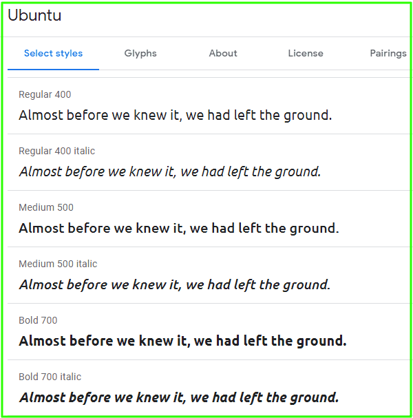
The Ubuntu Font Family, designed by Dalton Maag, is a set of matching fonts that are intended for use on user interfaces and visual communication. The fonts are intended to be used on-screen by end-users rather than at low resolution in print.
The Ubuntu font is suitable for use in blogs, posters, magazines, and books with a focus on readability and clarity of presentation.
The font has been designed to strike a balance between the readability of fonts optimized for on-screen reading like Verdana and Courier New with the stylistic qualities of traditional serif and sans serif typefaces.
12. Merriweather
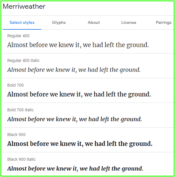
Merriweather was designed to be a text face that is pleasant to read on screens. It features a very large x-height, slightly condensed letterforms, mild diagonal stress, sturdy serifs, and open forms.
The typeface includes four main weights as well as an accompanying italic design. Merriweather’s larger x-height makes it highly legible on the web when used in smaller sizes.
Further, the typeface provides an inviting feel when used in larger text sizes. The italics are designed to be as readable as possible while still maintaining a calligraphic flavor that complements the Roman.
Merriweather is available in four weights with accompanying true italics throughout all styles. Merriweather supports a broad range of languages and is designed to work well with the most popular font families on the web.
13. Nunito
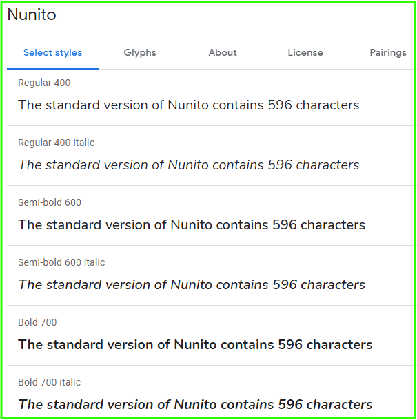
Nunito is a sans-serif typeface project that was created by Vernon Adams in 1996. The typeface is rounded and terminal in style, which means that the typeface has uniform stroke endings for all weights without any sudden changes.
What makes this typeface unique is that it has a striking resemblance to Frutiger’s designs, with the exception that it has only one stem per letter. It is quite a bold and strong typeface it, therefore is ideal to use for logos or headlines. However, because of its wide availability in certain publishing software programs such as Adobe InDesign, it can also be used for body text.
This typeface is ideal for creating professional logos and headings, as well as being used on posters and invitations. It can also be used as a display font for websites or blogs to give them a professional look.
The standard version of Nunito contains 596 characters, with glyphs that support Central European languages including Albanian, Celtic, Cypriot Greek, Romanian, and Turkish language systems.
14. Playfair Display
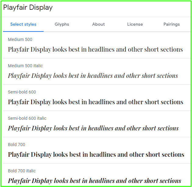
Playfair Display is a nice-looking, very readable font. However, the script and some characters can be hard to distinguish (see references).
In our opinion, Playfair Display looks best in headlines and other short sections of text such as titles. It will not work well when used for long passages of text due to spacing issues that make it harder to read.
What we love about Playfair Display: All caps are very bold making everything easy to read. The italics are gorgeous! They have a lovely slant also known as an oblique cut with clean edges. There is no hinting so letters don’t appear fuzzy at smaller sizes – great for both print and screen media!
15. Rubik
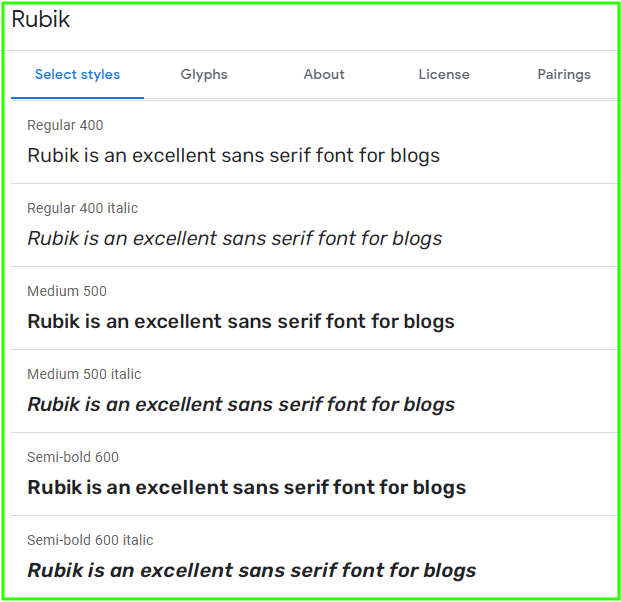
Rubik is an excellent sans serif font for blogs with slightly rounded corners designed by Philipp Hubert and Sebastian Fischer at Hubert & Fischer as part of the Chrome Cube Lab project.
Rubik is a sans serif font family with slightly rounded corners designed by Philipp Hubert and Sebastian Fischer at Hubert & Fischer as part of the Chrome Cube Lab project.
Rubik is a 5-weight family with Roman and Italic styles, that accompanies Rubik Mono One, a monospaced variation of the Black Roman design. Rubik Italic comes in 3 weights: Regular, Semibold, and Bold, and also features small caps
16. Lora

Lora is a serif font that has origins in calligraphy. It’s well-balanced and has moderate contrast, which makes it stand out when used for body text.
Lora will look good with a paragraph, as it is loved for its beautiful brush strokes contrasted against its serifs. Technically optimized for screen appearance, this font will also look great in print.
The font has been downloaded over 60,000 times, making it one of the most popular free fonts on Google Fonts. One way to use Lora font would be to set it as your blog’s font so your viewers will get a professional look and feel to your site.
17. Work Sans
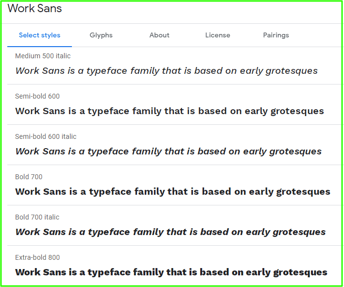
Work Sans is a typeface family that is based on early grotesques, like Stephenson Blake, Miller & Richard, and Bauerschen Giesserei.
This font family has a regular weight and other fonts in the middle of the family are optimized for on-screen text use at medium sizes (14px to 48px) and can also be used in print design.
The fonts closer to the extreme weights are designed more for use on-screen as well as in print. Overall, features are simplified and optimized for screen resolutions
18. Fira Sans
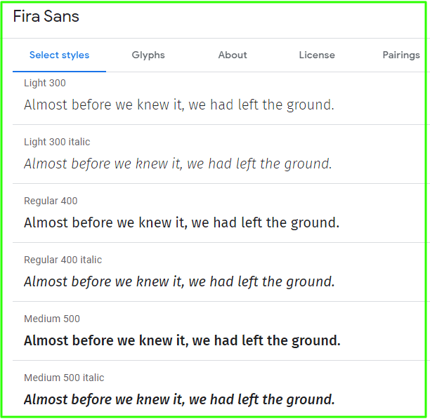
This is definitely one of the more unique fonts we’ve seen online as it was specifically designed for onscreen technology so you know it’ll be sharp and clear regardless of how small your text is.
The typeface has a tall, thin form but with strong strokes which helps add some personality to your content while also standing out from similar titles like Helvetica or Futura.
If you need something interesting then give this font a shot since its big capital letters will make everything stand out without being too distracting.
19. PT Serif
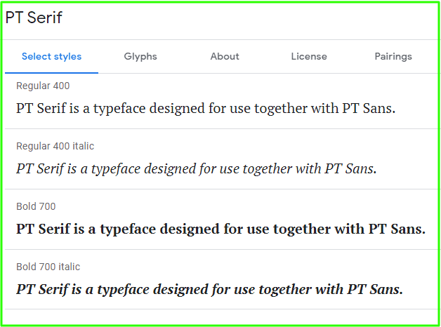
PT Serif is a typeface designed for use together with PT Sans. This typeface comes in different weights, including regular and bold.
The difference between the two is that the regular is more formal and the bold will be more used for headlines. The family consists of six styles: regular and bold weights with corresponding italics form a standard font family for basic text setting; two caption styles in regular and italic are for use in small point sizes.
PT Serif draws inspiration from early 20th-century typefaces and their rational design. The lowercase a is based on the Roman serif model, with horizontal strokes of equal weight.
The x-height of the PT Serif is larger than for common text faces, so it is readable even at small sizes. It also has prominent ascenders and descenders to increase the visibility of blocks of text in lists or narrow columns.
PT Serif is designed for use in small sizes, as well as in longer texts where a traditional serif typeface would be too heavy
20. Oxygen
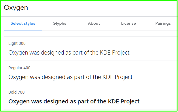
The Oxygen font is a typeface that is considered by many to be the best one for standard use. It has well-thought-out characters with comparatively low x-height and high legibility.
Oxygen was designed as part of the KDE Project, a libre desktop for the GNU+Linux operating system, and has been optimized for use with FreeType. Oxygen fonts are used in many graphical user interfaces (GUIs). They are also considered to be very readable
This is a web font version of Oxygen, designed to be used freely across the internet by web browsers on desktop computers, laptops, and mobile devices
21. Arvo
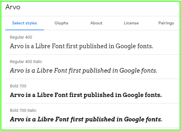
Arvo is a geometric slab-serif typeface that is suited for both screen and print. The family includes 4 cuts: Roman, Italic, Roman Bold, and Bold Italic.
Arvo is a Libre Font first published in Google Fonts. It falls under the Free license and is one of very few Libre fonts that are of such high quality.
Its usability and quality make it stand out among the competition in terms of Libre fonts. Arvo is advertised as being “as cool as ice” which might not seem like much but does act as a good hook for potential buyers. Its functionality is also high with glyphs included in the family such as monetary symbols, fractions, and even some icons.
22. Zilla Slab
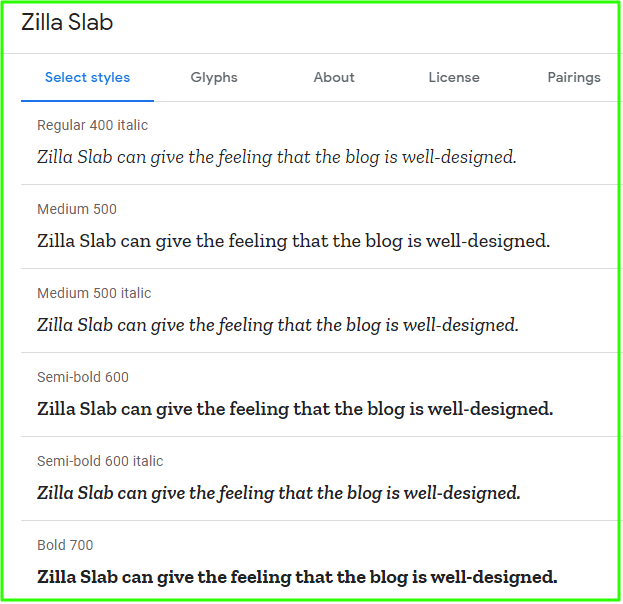
Zilla Slab is a contemporary slab serif typeface that was developed by Typotheque. This slab serif typeface has been used by Mozilla as their core typeface. It can be seen in the Mozilla wordmark, headlines of all designs for the browser and it is also used for body text as well.
The design of Zilla Slab is based on Typotheque’s Tesla, which means that its curves are smooth and true italics are included in all weights. Zilla Slab is seen to have a sophisticated industrial look while still remaining approachable with any weight
This typeface can be used for a variety of mediums, including reading news, magazines, and blogs.
Zilla Slab can give the feeling that the blog is well-designed because of the serif font being used for headlines but still looks casual with body text in a sans serif which makes it approachable to visitors. Serif fonts have been said to be superior in print or even on paper, which would correspond with blogs because they are usually read using a computer.
23. Bona Nova
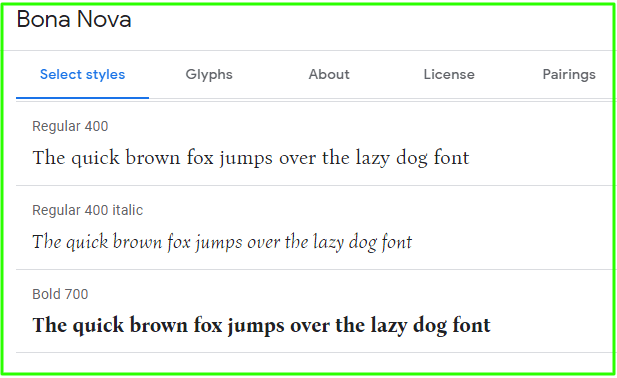
Bona Nova is digitization of Bona, a cursive typeface designed in 1971 by Andrzej Heidrich. Besides giving it digital form, this project was the opportunity to expand the character set and design new features for one’s favorite font.
Two more versions were created: Regular and Bold; these give families an old-fashioned charm like that found in classic trilogies (ie Star Wars).
The typeface is a humanist sans serif with an extremely open letter spacing. The family consists of three weights – Regular, Bold, and Light – each containing two styles: the roman and italics.
All styles are equipped with small caps, ligatures, alternate forms, and OpenType features such as fractions or ordinals for example.
24. Maven Pro
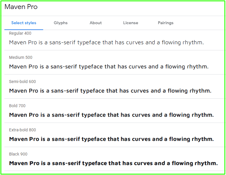
Maven Pro is a sans-serif typeface that has curves and a flowing rhythm. The forms of this typeface make it very distinguishable and legible when in the context of design. Its modern design is great for online environments, and it fits in any environment.
25. Domine
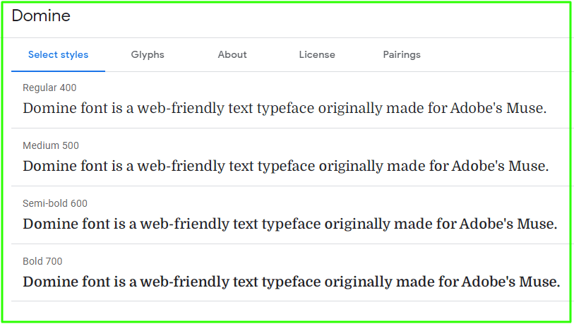
Domine font is a web-friendly text typeface originally made for Adobe’s Muse. It is useful for the blog because it provides the reader with eye relief and is one of the best Google fonts available. It is good for 11px to 14px headlines.
Easily readable: The size range of this typeface is 11px to 14px, which is perfect for blog use since it gives readers optimum comfort when reading a post on the browser.
If you’re looking for fonts with large x-height (the distance between the baseline and the mean line of lower-case letters), then choose Domine because it has 9px cap x-height, while most fonts have around 7 or 8 px cap x-height.
26. Acme
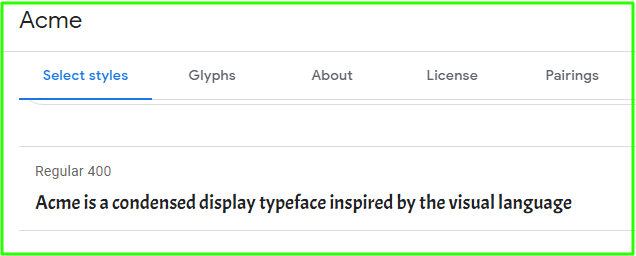
Acme is a condensed display typeface inspired by the visual language of classic cartoons and comics. It was designed to be used in headings and has a particular and groovy rhythm.
The resulting texts are bright but consistent, and their expressive characteristics work as well on screen as in print. The glyphs were each carefully designed, with top curve quality. It is well balanced, and carefully spaced by eye.
I have been using Acme for my blog’s headline font for a while now, and really like the clean simple look it brings to my blog. In addition to this font, I am also using another Google font called “Lato”. These two fonts go nicely together because they are both simple fonts that bring a lot of clarity to the page.
27. Vollkorn

Vollkorn is the first typeface design by Friedrich Althausen. Vollkon has a dark and meaty serif, as well as bouncy letters that give it an air of energy.
The intention for this font was to make something clean yet kind but can also be used in less formal settings like body copy or even just headlines and titles because it’s strong enough to stand out without being overwhelming.
28. Bitter
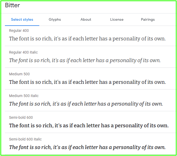
This typeface is designed to be readable on any device without being visually affected by the pixel grid. It has many features that are similar to humanistic fonts, but it’s unique in its own way with subtle characteristics and a certain rhythm injected into text.
The font is so rich, it’s as if each letter has a personality of its own. It can be used on posters and flyers to draw attention or for advertising purposes with an interesting design that doesn’t overpower the text but rather enhances it without overwhelming you.
29. Crimson Pro
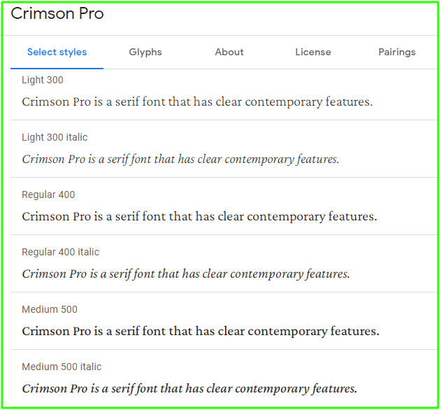
A typeface family with something for any reading experience, Crimson Pro is a serif font that has clear contemporary features.
The fonts are reminiscent of Garamond-inspired types and have 8 weights in Roman and Italic styles to choose from which can be given weight according to your needs thanks to the variable design.
30. Radley

Radley is a functional typeface that works well for both titling and text typography. It was originally drawn as lettering in wood cuttings but later digitized so it could be used on the web. Radley’s design stems from hand-carved letters quickly done by craftsmen with style to spare!
While many modern fonts are created on computers using digital tools, Radley is designed the old-fashioned way: with a chisel. The basic letterforms were sketched and carved into wood by hand before being scanned in to be traced digitally.
While some may find this archaic technique too time-consuming or difficult, there’s something about working with traditional materials that makes it worthwhile for those who can manage it – especially when you’re creating an original font like Radley which takes its inspiration from these rustic roots!
Conclusion
If you want to make your website design stand out from the crowd, then some fonts may work better than others.
You should consider how readable text will look on different devices and font sizes before deciding which one is best for your site’s body content if possible.
If not, we recommend picking a script or display style that has clearer lettering at small sizes since this can be more difficult with decorative options like Lato Display.
It also helps to have something larger available in case visitors need something they’re able to read without squinting but still want an aesthetic feel to their blog posts or websites so Octin Block could be worth considering as well.